Pohditko, mitä ideasi kehitys voisi maksaa? Kokeile investointilaskuria
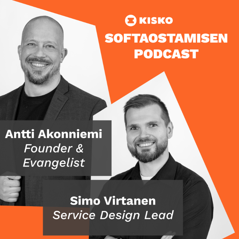
Epäonnistuneiden ohjelmistoprojektien aika on ohi. Tämän podcastin tarkoitus on avata softaostamisen sudenkuoppia ja antaa käytännön työkaluja, joilla projektisi todennäköisemmin onnistuvat.
Kuuntele Spotifyssa
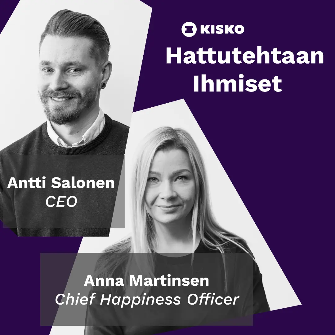
Parannamme suomalaista työelämää, tietotyöläinen kerrallaan. Podcast ihmisistä sovelluskehityksen takana.
Kuuntele Spotifyssa
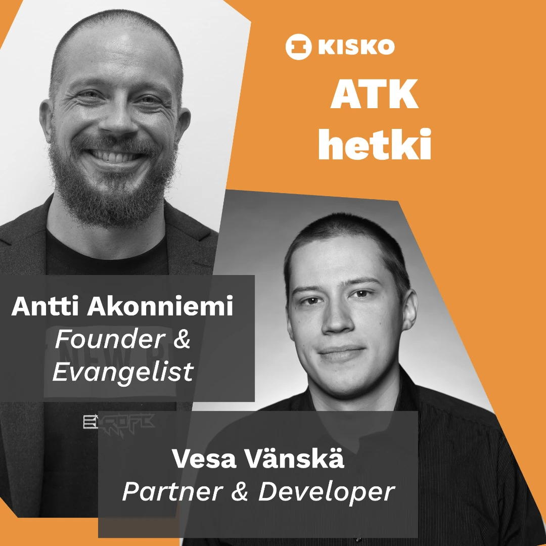
Vesa Vänskä ja Antti Akonniemi keskustelevat teknologiasta, bisneksestä ja itsensä kehittämisestä.
Kuuntele Spotifyssa